HackDuke 2026
HackDuke is a student-run hackathon at Duke that exists to get students building technology for social good. For the 2026 event I owned the end-to-end design of the landing page, working alongside a 5-person design team who scaled the identity across the rest of the site.
Visit the site →Polished, but interchangeable
HackDuke rebuilds its visual identity from scratch every year — new theme, new site, new assets — against a hard deadline before applications open. The 2024–25 site, "Underwater Rave," was polished: neon gradients, an underwater scene, floating stat cards.
That was the problem. It read like a dozen other university hackathon sites chasing the same sleek tech-conference look, with little in it that felt like HackDuke specifically. The 2025–26 site needed to do more than look good — it needed to feel like a place students wanted to show up to, not another well-executed CS-club page.
Approachable to first-time hackers
Make the event feel approachable to first-time hackers rather than just CS majors, and lift registration conversion from the landing page specifically.
Inheriting a theme, then leaving it
I inherited "Underwater Rave" — deep purples, neon, an ethereal space aesthetic — and led the transition to 2025–26's "Urban Convenience Store": warm, lo-fi, community-driven instead of cold and technical.
Three decisions that shaped it
The landing page was mine alone; the rest of the site's assets were a 5-person effort. I wanted to get away from standard tech — dark, sleek, minimal — and toward something lo-fi, anime-adjacent, and character-driven.
Code for good should feel as approachable as walking into your neighborhood corner store, not like stepping into a tech conference. That went straight into the page: a literal storefront, awning and all, with HACKDUKE / CODE FOR GOOD as the signage, sponsor logos running along the window like a decal strip, and a click-to-open door as the entry point to the rest of the site.
I wireframed in Figma Make before touching visual design, which cut early iteration time by roughly 70% against the team's estimate for their usual, mostly-manual landing-page process.
I worked directly with HackDuke's tech team through the React implementation, matching the Figma 1:1 — custom illustrations and responsive behavior included.
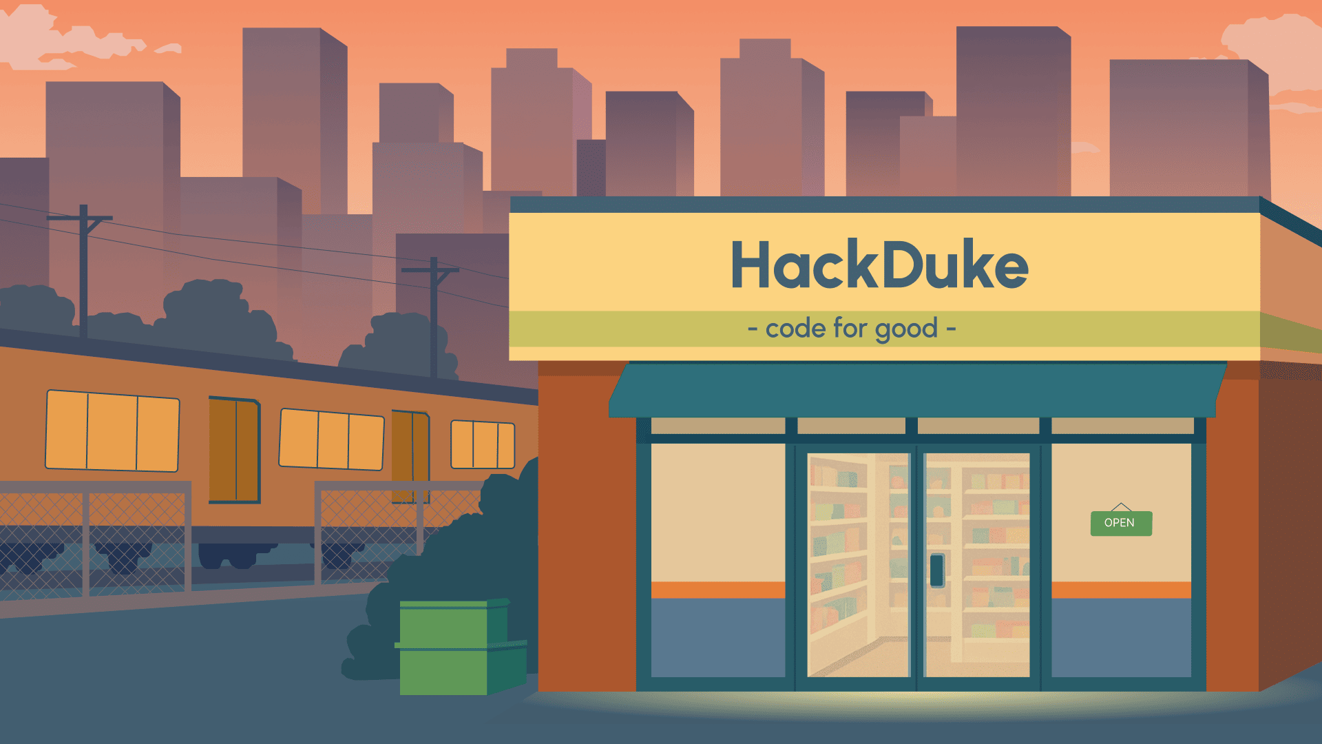
An early prototype from the Figma Make wireframing phase — the "corner store" concept was locked in before the color direction was finalized.
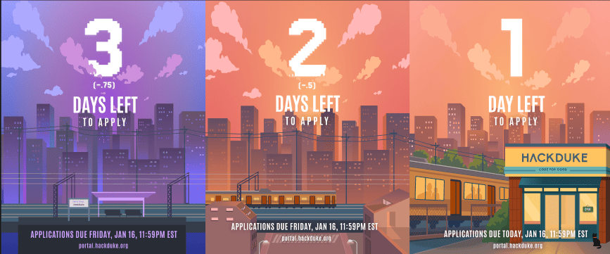
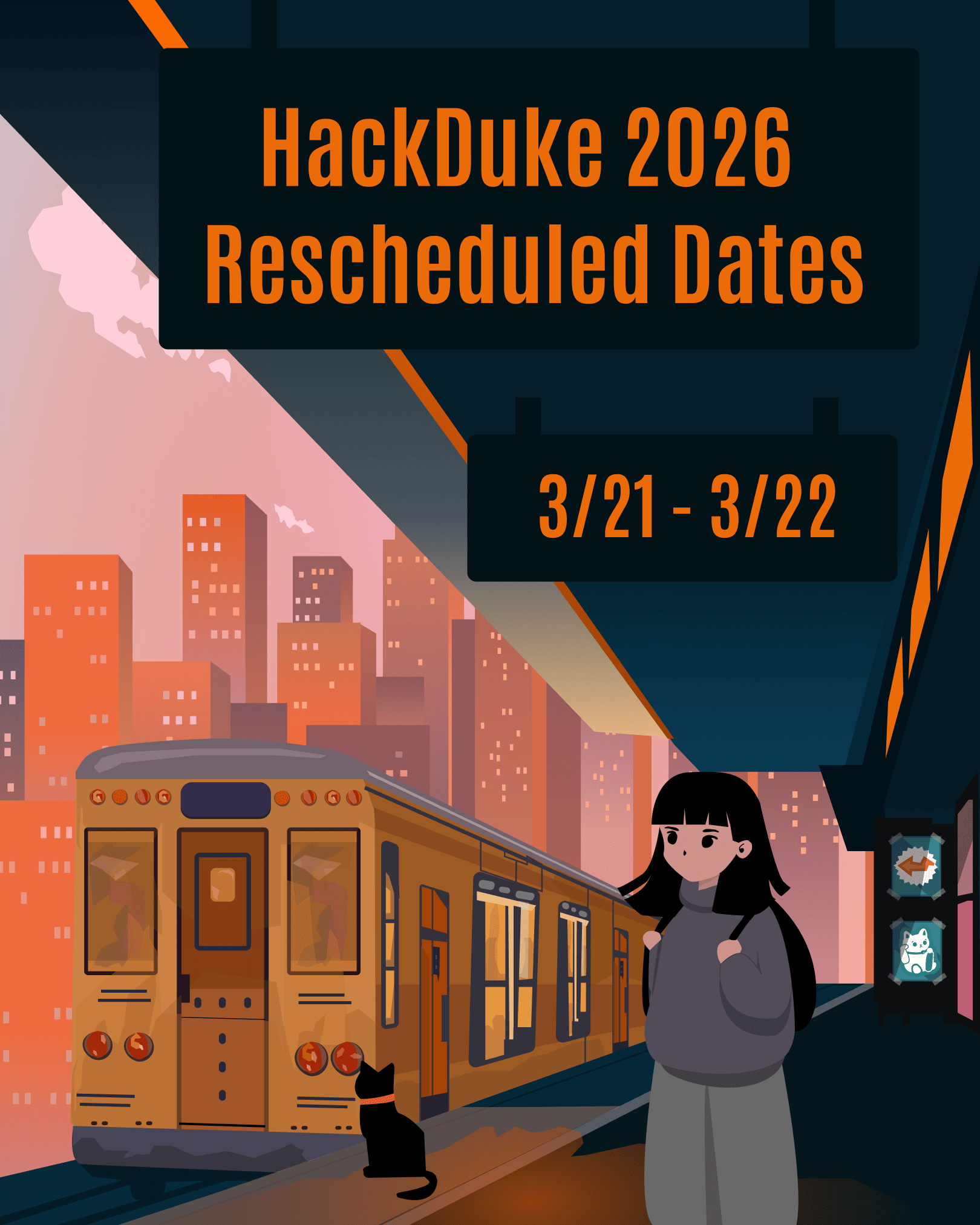
Alongside the site, I designed countdown and announcement graphics for Instagram so the identity held across platforms. Two things made that work: modular Figma templates that supported daily countdown updates without rebuilding assets from scratch, and carrying the same gradients, illustrations, and urban motifs from the landing page into the posts.
What moved
Registrations went from ~500 to ~900 participants (+80%) after the redesign and theme change. The number I'd stand behind more firmly is landing-page conversion, which doubled — the overall registration figure reflects more than the site alone.
What I'd do differently
Next time I'd bring the tech team in during early prototyping instead of after. The interactive landing page was one of the most creative parts of the site and also caused real confusion — several participants told me the sliding-door interaction wasn't obvious enough as an entry point, which likely cost sign-ups. Discoverability of an interaction like that needs to be tested with real users before launch, not diagnosed after it.
I'd also lean harder on AI-assisted tooling — Figma's MCP server with Claude, for one — to cut landing-page build time. Design was a hard blocker for every other team on this project. A faster design-to-build pipeline wouldn't just save my time; it would let sign-ups open earlier and give everyone else more runway.